Mood boardAnnotations
Wednesday, December 7, 2022
Wednesday, October 12, 2022
Drink Advert
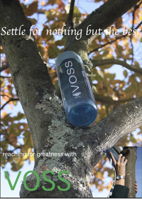
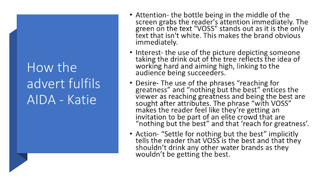
We chose VOSS water as the drink we promoted because we felt it fit in with our psychographic’s values. Our psychographic was succeeder and VOSS is considered to be a more expensive brand of water- spending more money on something as simple as water is something we believed our succeeded psychographic would be likely to do. I chose the shot in the tree as it elevated the water, connoting that is the best water brand- which is anchored by the typography reading “settle for nothing but the best”. The typography “ reaching for greatness with VOSS” anchored by the image of someone reaching up and grabbing the VOSS from the tree appeals directly to our target psychographic as it reflects their values and ideologies of them settling for nothing but the best and striving for greatness, working hard until they are at the top. The word “with” connotes togetherness and gives the idea that VOSS is the audiences ticket to greatness which is something our psychographic strives for.
Thursday, September 22, 2022
Photoshop
First Photoshop Attempt
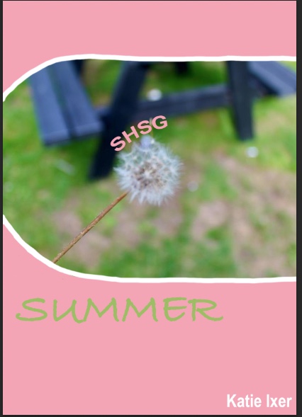
First I made my background colour using the paint bucket tool then I added a photo and transformed it to scale. I then used the magic eraser tool to blend the photo into the background by rounding off the edges. I added a white boarder around the edges using the paint tool to make the photo stand out. I added three text boxes and used the different colours already on the page to tie these text boxes in. The green text ties in with the grass in the photo, the white text ties in with the name at the bottom and the pink text ties in with the background colour. I added an effect to the "SHSG" text box so that it framed the dandelion and I changed the fonts so that they fit in nicely with the theme of the photo.
Tuesday, September 13, 2022
I chose this photo because I liked the how focus on the subject is clear through how the background is blurred. It also gives a nice contrast between the detailed focus on the stem of the dandelion and the lack of detail in everything else around it which emphasises the detail in the subject of the photo. I also decided to make the photo more vibrant because it gives the focus a nicer background to be against.
Subscribe to:
Comments (Atom)
Intertextuality in final submissions
- Costuming in the Front cover of the second edition front cover and the film page on the website are intertextual references to outfits wor...

-
Website: https://17-kixe.wixsite.com/lights-camera-action Welcome to the first edition of Lights Camera Action! This magazine is all about...
-
Whist I was doing my research I found a website which I will refer to throughout my research.


